Commercial expositions, fairs (also मेला (mela) as commonly known in India) and exhibitions are temporary or semi-temporary spaces aimed at marketing products and services, build new and strengthen existing connections and serve an opportunity for organisations to test experimental concepts before launching them into the market based on the audience feedback.
This literally translates to advertising in an enclosed and curated physical space measured in footfalls and registrations as opposed to that on a digital media via page visits, screen clicks and hovers. And although digital advertising has its own (controversial) merit of providing better control over personalisation of ads and collection of impression metrics, physical arenas offer an opportunity for more immersive experience and long-lasting brand recall. It is hence, still a popular choice of marketers.
As a part of my internship at Pavilions & Interiors Pvt. Ltd., my colleague Srinivas and I, conceptualised an interactive installation which would serve as a networking point for visitors present in an exposition area. We called it Expo-ring.
Our ideation process was based on this strong belief that novel experiences are anchored around product discovery and interactive installations in an exhibition engages audience for a longer duration, which would exciting for the participant and eventually beneficial for the client. This led us to frame our scope within which our design considerations would revolve.
Firstly, for the sake of maximum visibility, we had to position this installation at a major node in the expo arena, where wandering audience were relatively high.
Secondly, the installation, for the purpose of multiple uses, was suppose to have a modular design, and a form generic enough to accommodate multiple types of content.
Thirdly, since it would be in a high traffic area, the installation should have the ability to involve multiple people at the same time and space them out to reduce unnecessary jostling. We saw this as an opportunity to create a structure that invited users to interact in a collaborative expression or ‘art-making’ process simultaneously.
Fourthly, the installation should capture intent-based data from the audience to present to the marketers.
Lastly, due to constraints around money, material and time, we had to use light as the medium of our installation.
BRIEF An on-site, modular light installation that invites collaborative interaction and generates possibilities of meaningful conversations between the exhibitor and their audience and aid in data collection and intent capture.
Exhibition spaces generally feature products or company portfolio in videos, which play on loop. Similar is the interaction of a virtual 3D model that is pivoted around an axis to display features, details, etc. The presence of this circular motion of camera or time in a typical exhibition setup intrigued us. Inspired by the idea of a non-linear model of time, our research began in appropriating a form for the installation that would justify these interactions. For designing our installation we stuck to the basic framework of interactive design which is Interface, Interaction & Information.
A scroll-based interaction hence caught our attention because it could communicate many ideas that are related to product presentation and display. These might be X-ray scan of an image, the manufacturing process or timelapse and viewing products from all angles. Additionally, it could be used to rate a product.
INTERACTION DESIGN
Responsive LED touch surface are not a new thing, they are everywhere: on your smartphones, smartwatches, laptops, etc. While they should have been an obvious choice for our interface, they are not available in custom shapes (especially for prototyping) and are very expensive. Also remember, we were supposed to make a modular design. Hence, it become necessary for us to reimagine our touch interface which we conceived on the same principles of a capacitive touch screen i.e. an array of tightly packed touch points that are indexed and mapped to a controller.
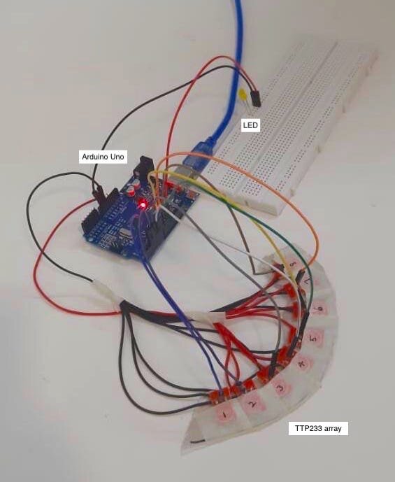
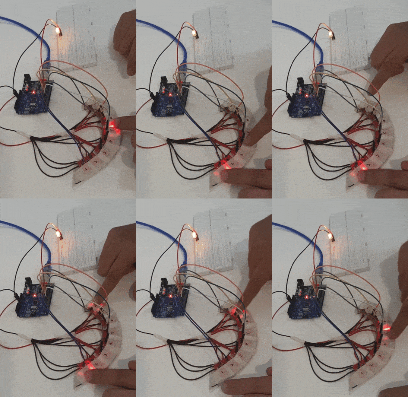
We started testing this idea with the most basic touch sensor available in the market, the TTP223 and started noting the advantage and disadvantage of using this modified interaction.
ADVANTAGES:
Cheap, Robust, Prototype friendly: Controlled using an Arduino Uno, and with all the parts together, the setup costed within ₹400
Easily available: A vendor for custom shape LED touch surface is not easy to search, online or offline. Compared to that the setup above can be found in almost any mechatronics or robotics shop.
Testable: Using Arduino IDE, our interaction can be testable for their efficiency (this will be helpful later).
DISADVANTAGES:
On-surface visuals: The setup obviously lacks the feature of on-surface display. This can however be countered with projection mapping.
Smoother interactions: The granularity of the touch sensor is compromised with bumpy transitions and sharp edges. An attempt to solve this is made in the next iteration.
Few touch points: With the TTP223, every digital pin of the Arduino can only cater to one touch sensor. The above example engages 8 pins of Arduino Uno. This is undesirable has it significantly reduces the number of touchpoint / increases the need for multiple controllers.
The aim of the new iteration was to retain the advantages and eliminate the disadvantages of the system. In comes the MPR121 touch sensor. More touchpoints give opportunity to negate the last two disadvantages.
MPR121 touch shield
The IC is I2C compatible with the default address of 0x5A.
Iteration 2 : Copper strip extension test
8 TTP223s were replaced with one MPR121 touch shield that had 12 touch endpoints. This test increased the range of individual touch points but increases the changes of debouncing (capacitive interference from adjoining nodes). Later, we realised that this was due to low current.
INTERFACE DESIGN
—
The Skeleton System / Form design
Initial rendering and plan for Expo-Ring. We initially did not have LED strip as a part of the installation. Also the fabrication options were limited and help our first model was bulkier and heavier than what we expected. Also, we sliced the model along the XY plane (Z-axis facing upwards) for easier access to the electronics.
Initially conceived to be in a circular form, the ring was made into an ellipsoid to test how skewed shapes would appear in the space. The structure consisted of 2 parts: the base which was divided into 4 quadrants and had grooves to carry the circuitry and 2 half-lids that would cover the structure to give a seamless feel.
Protrusions and holes on these allowed easy assembly and removal in case the electronics needed attention. A groove runs through the inner rim to support the placement of RGB Led strip which would later be diffused using milky acrylic strip. The entire structure would rest on thin fish wires that would suspend it in space somewhere in between the average human waist-line and eye-line.
—
The Nervous System / Electronic circuitry
The electrical circuitry or the ‘nervous system’ of the installation is the master-slave communication system between the arduino and touch sensors based on the i2c model of communication. To support so many capacitive touch points, the we used a 5V-2A adaptor and connected the 3.3V pin of MPR sensors to the 5V pin of arduino. To learn more about the technical step please visit the Github page.
Indexing touch points: Small scale prototype for initial testing. The prototype was made with layered MDF sheets and had an RGB Led strip attached to the inner rim of the installation. The MPR121 touch shields were places in 4 quadrants of the ring and each had 12 touch points extended to the surface of the ring. All these 48 (12 touch points x 4 sensors) touch points were indexed and respective touch shields connected with the Arduino controller in a master-slave i2c setup.
INFORMATION (CONTENT) DESIGN
Unfortunately, this is where our project got terminated prematurely because of the Covid-19 lockdown. But, the few content that we planed for the installation are displayed below. All these examples have the same basic setup with a little variation based on the story we are showing.
The Ripple Effect imagines an interactive graphics that responds to the touch mapped on the Expo-Ring to mimic the ripples on a ‘string’ of water. This can be a multi-touched based interaction and its form and colour assignments can be changed give richer information.
The Time-lapse The most traditional use of the installation is too view a chronological array of images with complete control with the user to vary its speed and direction. Its like controlling and GIF image physically.
Polling system The ring can work as a feedback installation/polling system for visitors to playfully share their exposition experience. Speed of feedback can be mapped to other parameters like thoughtful vs impulsive responsive.
Zoetropes Why not give the 3D object on display a swirl and unfold the story it holds. Zoetropes, can convey fun and animated story-lines coupled with physical interaction. A perfect content for Expo-Ring.
All these examples confirm to the ellipsoidal form of the Expo-Ring but the possibilities of story-telling are endless. While our first prototype was bulky, heavy and riddled with many software bugs, we see a lot of potential in the product. However, the concept of contact based interaction in the post Covid-19 world will not sustain and has to be reimagined. Maybe we will use proximity-based sensors for the same. We are hopeful that the world will return to a state where we are no longer afraid to be too near to each other. Until then, we explore things virtually as everyone else!
Also, let us know your views in the comments :)
We cordially thank Mr. Arun Baburam and staff at Pavilions & Interiors who made us come this far.


